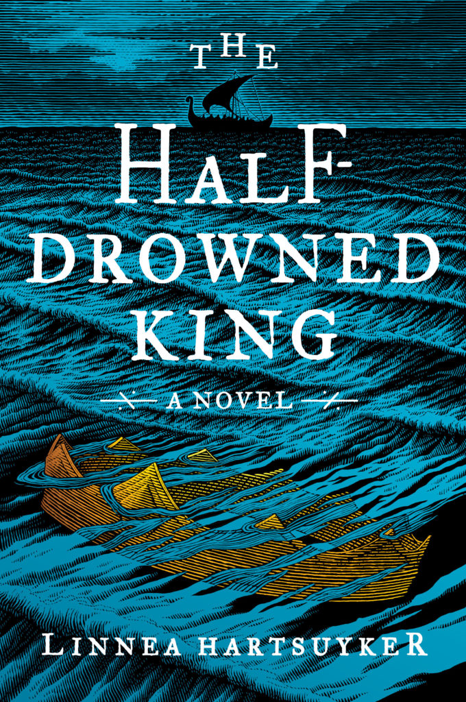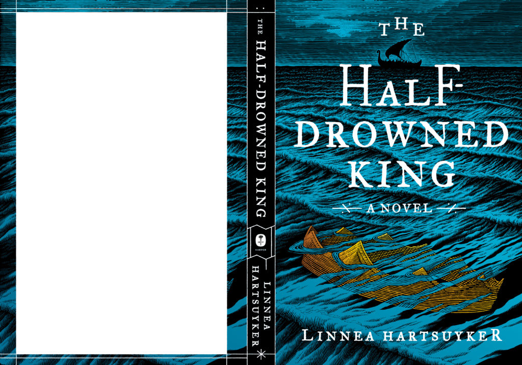
One of the things people always ask about book publishing is how much say I get in the cover, and the answer is that I don’t get much, but I didn’t want much. I appreciate good design, but I’m not a visual artist. When people asked me about the cover, I always said I just hoped it didn’t involve a woman clinging to the ankle of a bare-chested viking warrior–but I’d be happy with that if my publisher really thought it would get the book into the hands of readers who would like it. I maybe pictured the prow of a viking ship, maybe with some misty figures. I never pictured something as beautiful as what HarperCollins did above.
I was consulted quite a bit in the development of the cover. We considered adding more viking imagery (knot work, an arm ring, etc.) but eventually decided on this, with the clear symbolism of the crown, and I love it.
There will be different covers from all of my overseas publishers, so I will share those when they are available. But here is what you will hopefully see in Barnes and Nobles, airport bookstores, people’s hands on the subway…and it has my name on it!
